
My complete version of the 36 Days of Type project is now uploaded on Behance! Check it out here!

My complete version of the 36 Days of Type project is now uploaded on Behance! Check it out here!

After coming across the 36 Days of Type projects on Behance, I was really excited to have a go at creating my own. This week I will be uploading my completed project onto my porfolio. Although it was quite time consuming, I managed to complete the project over the course of 2 week since placement is quiet. I had fun with this but next time, I will try something a little more challenging. This task has also helped me to develop and adapt to new techniques I usually wouldn’t use such as the blend tool, half tone and precise drawing through Illustrator.

Another experiment I created based on the font ‘Futura’. I have been enjoying experimenting with colour and type to create playful and lively combinations. This project is now available to view on my Behance portfolio
Last week I decided to have a go at designing my own typeface. I used Futura condensed as a guide and created a geometric colour block style. I’m pleased with the outcome as it started as just an experiment. I have also been busy updated my Behance portfolio. I’ve added a few projects which are available to look at here.

Here is one of my own versions of creating my own brush that I can use to create type. I chose bones as its simple but creative. After lunch I think I may try something more complex and challenging to push the boundaries of this technique.

After enjoying the previous tutorial on creating rope style type, I decided to look for something else similar. I came across this tutorial by Andrei Marius. This was really easy to do and i love the outcome. Now I understand how to create this, I will practice this next time using my own ideas.
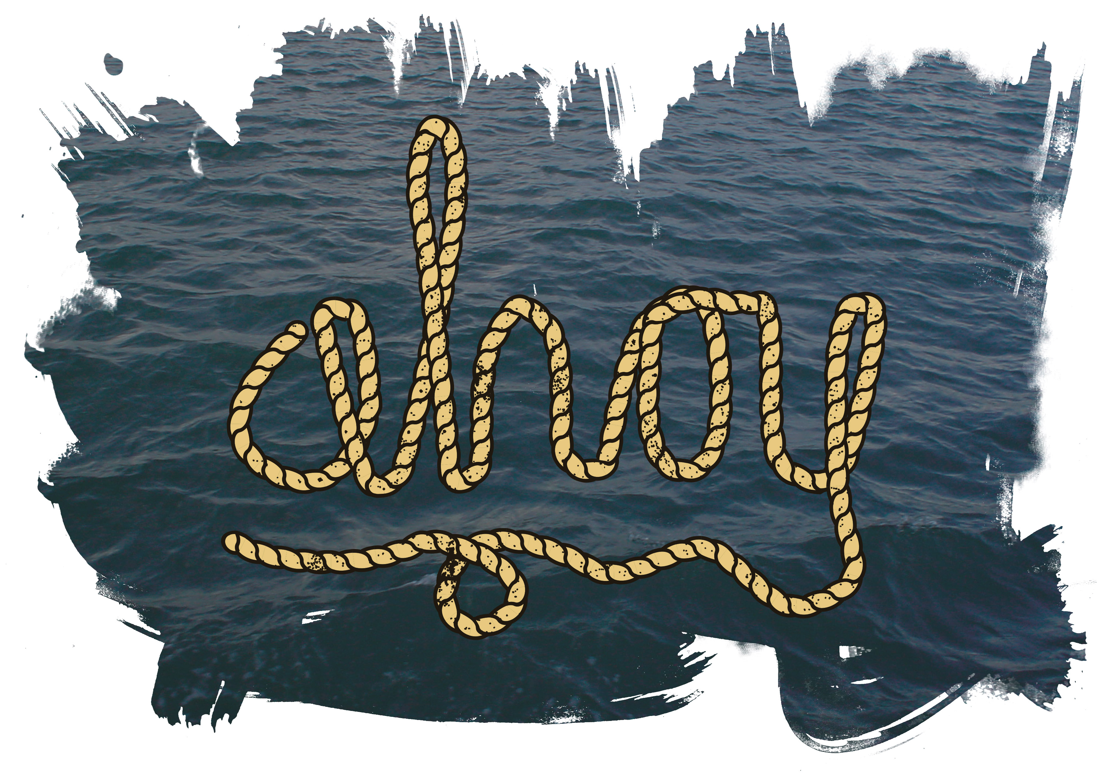
This morning I decided to follow a tutorial from Spoon Graphics which shows you how to create an illustrated rope brush which can be used to create type. I thought this looked really interesting as it’s really my style, I would love to adapt this to my own ideas. The tutorial was relatively easy and after reading about the difference between layer masks and clipping masks in Photoshop earlier this week, I decided to put my knowledge to the test. Clipping masks are really easy to create now I understand what they do, however I still need to work on my skills in layer masks as it’s something I always struggle with. Here is the final version of my type created in illustrator.

Today I chose to look into creating hand written type using an already existing font. In this piece I used DJB Messy Amanda Goes Bold available from Dafont.com. I used illustrated to type my quote out then used the direction selection tool to move around anchor points and positioning. Next I used the pen and brush tool to join letters together and add flicks and curls to the image. I dublicated some of these and slightly edited them to add a quick border. Once I was happy with the composition, I used the width tool to edit the end of lines making them thinner as if they had been hand drawn. To finalise my image, I moved it across to photoshop and played around with some of the effects. I was hoping to achieve a wet thick paint look, however this didn’t turn out as well as I’d hoped. I am pleased with the type but not the over all choice of colour and finalisation stages.

After breaking up for Easter, I took a vacation to Skipsea with a friend. It was raining pretty much most of the weekend so I took advantage of the time and decided to quickly sketch some more type ideas. Here’s one I chose to develop. Again I have used the live trace on Illustrator but I don’t think it has worked as well this time. The lines don’t seem to be as smooth or even so I think this could be developed to a more finalised look by creating the paths using the pen tool. I want the text to pop and so tried a more contrasting colour scheme. I think this worked well for the effect I was going for, however I still think I need to develop my knowledge of colour schemes more and experiment to see what else would work well.
Although Nicks type classes have ended, I wanted to carry on with my own development of creating hand drawn type as I really enjoy been able to draw freely and be imaginative. Typography is something I will consider specialising in as so developing my skills in this area is a must. I did this by sketching out random type and quotes in my book using pencil and fine liners which I then scanned into illustrator and used the live trace tool, editing the threshold and paths to ensure it was how I wanted. I think in this case, it worked better to use live trace rather than create paths using the stroke and pen tool as it gave it more of a hand drawn look. The only thing I am unsure of is the choice of colour. I think because I have used both bright and pastel colours, they clash and form a dull/neon contrast which doesn’t compliment each other. I hope through practice that I can achieve better results and improve my colour palettes.
